Window and View Overview
The Scheduler window consists of three main views.
This section explains the name and purpose of each view, along with the basic operations available within them.
For details about schedules and the priority rules applied to them, refer to the Schedule section.
Window
When you launch SmartSignage Scheduler (referred to as the Scheduler), the following window appears:
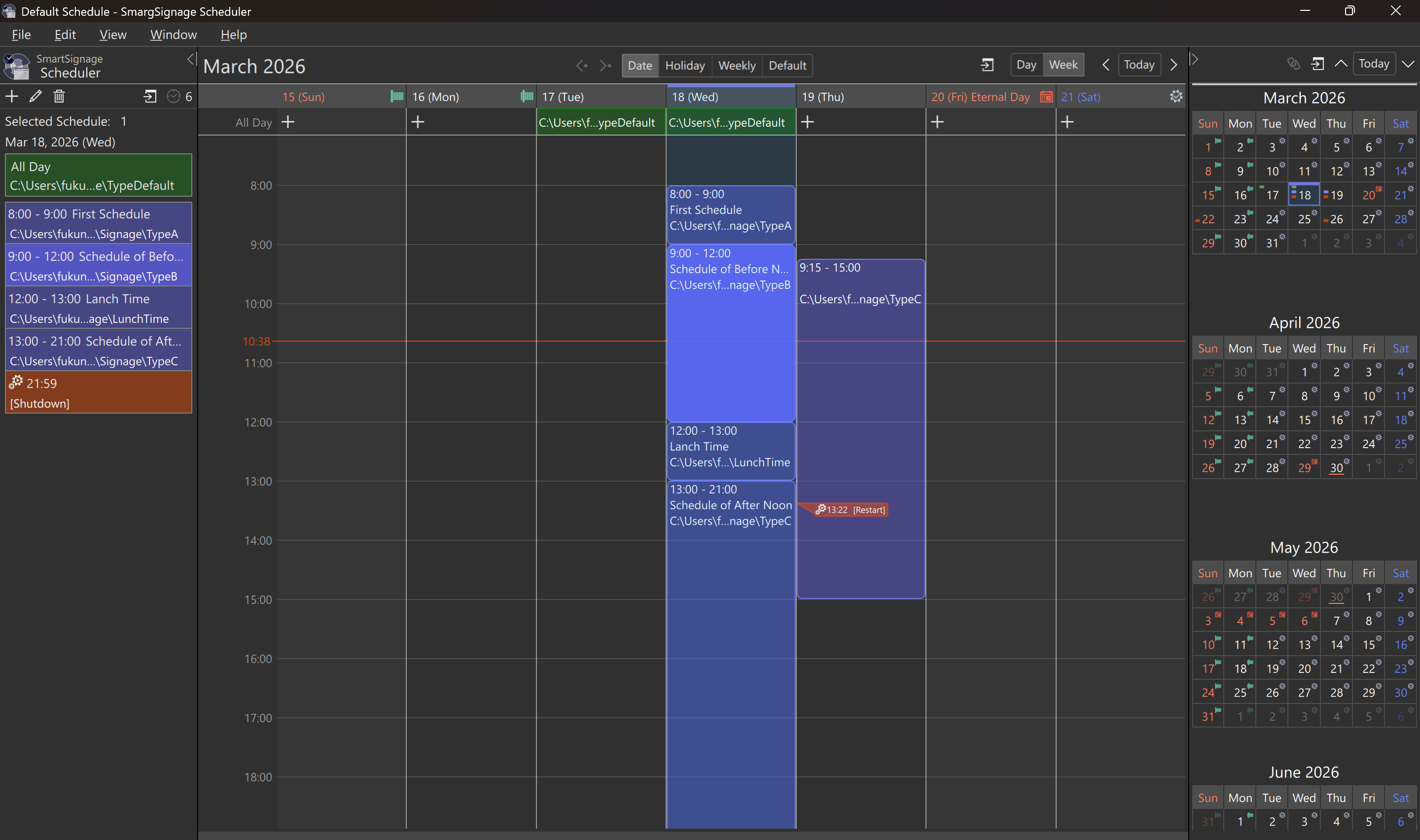
At startup, the Scheduler automatically opens the default schedule file, and the window displays its contents. (Figure 1 shows an example where several schedules have already been assigned.)
A single window can open one schedule file at a time. If you need to work with multiple schedule files simultaneously, the Scheduler will open one window per file. See also: Switch Windows
Default Schedule
When the Scheduler starts, it automatically creates a default schedule file and opens it in a new window.
If the Viewer (SmartSignage) is installed on the same PC as the Scheduler, and the Viewer’s settings specify Default Schedule, the Viewer will automatically use this default schedule file.
The file path of the default schedule is as follows:
[Windows]
C:\Users\<UserName>\AppData\Roaming\fukuneko.com\SmartSignage\schedule.fdscd
or
%AppData%\Roaming\fukuneko.com\SmartSignage\schedule.fdscd[macOS]
/Users/<LonginName>/Library/Application Support/com.fukuneko.SmartSignage/schedule.fdscd
or
~/Library/Application Support/com.fukuneko.SmartSignage/schedule.fdscdView
The window consists of three views: the Main View, the Side View, and the Month View.
The Side View and Month View can be collapsed to hide them, and you can also swap their positions between the left and right sides of the window.
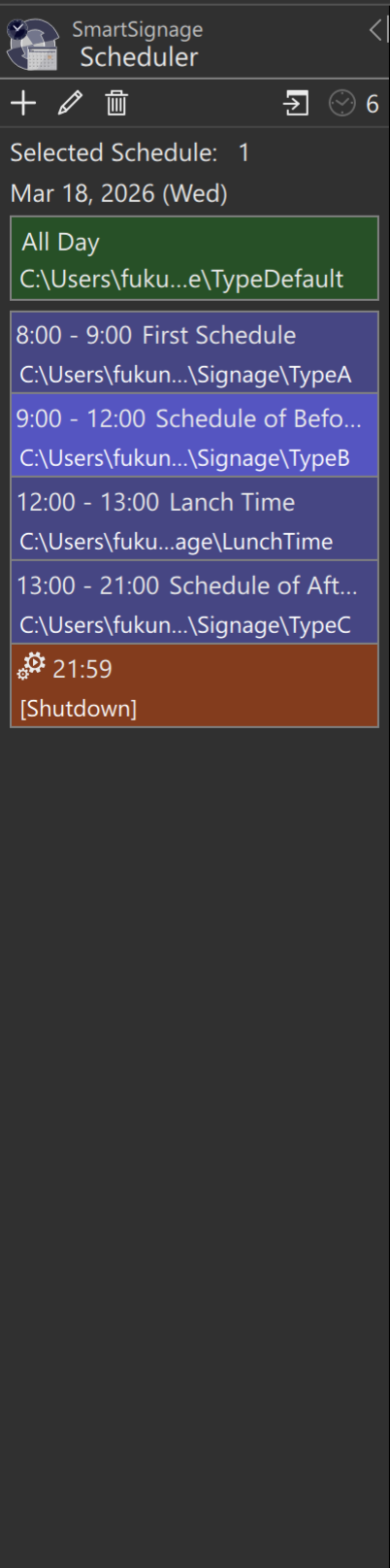
The following sections describe each of the three views in detail.
Main View
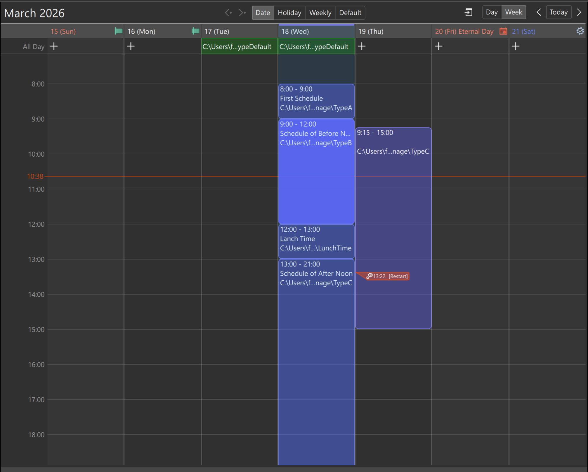
The Main View (Figure 4) is located at the center of the window.
Here, you can add, delete, and edit schedules.
When the Scheduler starts, the Main View displays a one‑week schedule, beginning on Sunday and including today. (The starting day of the week can be changed in the settings.)
Scrolling Left/Right and Jumping to Today
At the upper‑right corner of the Main View, you will find the Today buttons.
Select Today to scroll to the week that includes the current day.
Select to scroll to the previous week.
Select to scroll to the next week.
If you enable View → Enable Horizontal Flick from the menu, you can scroll horizontally using flick gestures.
Flick Gestures
On a touch panel, slide one finger horizontally.
On a touchpad, slide two fingers horizontally.
With a mouse, drag horizontally to perform a flick gesture.
If the flick scroll stops in the middle of a week, selecting any date will realign the view so that the left edge shows the beginning of the week. This behavior is intentional and not a malfunction.
Switching Between Day/Week View and Moving to the Selected Date
To the left of the Left / Today / Right buttons, you will find the Day Week buttons.
Pressing the button scrolls the view to the week that contains the currently selected date. This allows you to return to the selected date after scrolling with the left or right buttons.
The Day button switches the view to a single‑day display. In this mode, the left and right buttons scroll one day at a time.
The Week button switches the view back to the weekly display (the default view).
Switching Between Date-Specific, Holiday, Day-of-Week, and Default Views
At the top center of the Main View, the Date Holiday Day of Week Default buttons are displayed. These buttons switch between the different schedule types.
In the Date view, you can specify schedules for individual dates. Both the weekly display and the single‑day display are available.
In the Holiday view, you can specify the schedule that will be applied on holidays. This view always shows a single day.
In the Day of Week view, you can specify schedules based on the day of the week. Both the weekly display and the single‑day display are available.
The currently selected (active) column is indicated by a thick horizontal line at the top, shown in .
When you are in the Date view, pressing the button switches to the schedule type that is effective for the selected date. Pressing the button returns you to the original Date view.
Time Display and Schedules
On the left side of the Main View, the time of day is shown from 00:00 through 24:00.
If all times do not fit within the view, you can scroll to reveal the remaining hours.
Scrolling can be performed by flicking, using the mouse wheel, or by operating the scrollbar on the right side.
The scrollbar is normally hidden and appears when you move the mouse pointer to the right edge of the window.
The time displayed in a different color indicates the current time
(in Figure 4, this is 15:28).
You can assign schedules to each vertical column (date, day of week, etc.).
For details on how to assign schedules, see Add Schedule.
Assigned schedules are shown as colored bands, allowing you to visually confirm their start and end times.
These schedule bands can be moved or resized with the mouse to adjust their start or end times
(see Edit Schedule for details).
When you click a scheduled item or action item placed in a column, it becomes highlighted. While an item is selected, you can use the Edit menu to copy, paste, or delete it.
Tip
You can select multiple items by holding the Ctrl key (Windows) or the ⌘ key (macOS) while clicking.
Timed Schedules
Schedules displayed as bands in are called Timed Schedules. SmartSignage treats the folder specified in a Timed Schedule as the active data folder during that time period.
A Timed Schedule contains the following settings:
Time Range … Required
When the start time is reached, SmartSignage switches to the data folder specified in this Timed Schedule. When the end time is reached, it switches to another data folder.Name … Optional
Used to distinguish this Timed Schedule from others.Data Folder … Required
Specifies the path of the data folder to be displayed during this time period.
Timed Schedules support mouse operations.
Click a schedule band to select it before performing any of the following actions:
Normal Drag
Dragging anywhere except the top or bottom edge moves the entire schedule band, keeping its duration unchanged.Drag the Top Edge
When the mouse pointer changes at the top edge, dragging adjusts the start time.Drag the Bottom Edge
When the mouse pointer changes at the bottom edge, dragging adjusts the end time.
Tip
When dragging, the schedule band will stop when it touches another Timed Schedule.
Holding the Alt key (Windows) or the ⌥ key (macOS) while dragging allows you to move the band past other Timed Schedules.
For more details on Timed Schedules, see
Add Schedule,
Edit Schedule, and
Delete Schedule.
All Day Schedules
When the top area of a vertical column (date, day of week, etc.) is shown in , an All Day Schedule is assigned.
If no All Day Schedule is set, the icon is displayed instead.
An All Day Schedule is applied during any time period where no Timed Schedule is assigned. The only configurable item for an All Day Schedule is the data folder.
Triggers
Icons displayed like
 represent Triggers.
You can change the execution time by selecting a Trigger and dragging it.
The action specified in a Trigger is executed at the designated time. The predefined Triggers are as follows:
Shut Down
Shuts down the PC.Restart
Restarts the PC.Sleep / Hibernate
Enters Hibernate on Windows, and Sleep on macOS.
You can also specify any executable file as a custom Trigger.
For details, see
Add Trigger,
Edit Trigger,
and
Delete Trigger.
Side View
The Side View (Figure 3) displays a list of schedules for the currently selected column. By default, it is located on the left side of the Main View. Except for mouse‑drag operations, the Side View supports the same actions as the Main View.
Several icons are available at the top of the Side View:
Pressing the icon adds a new Timed Schedule.
There is no icon for adding a Trigger, so use the context menu to add one.Pressing the icon edits the selected schedule or Trigger.
Pressing the icon deletes the selected schedule or Trigger.
Pressing the icon scrolls the Main View to the currently selected column.
If the Main View and Side View are showing different schedule types, this action does nothing.The number displayed to the right of the icon indicates how many items (schedules and Triggers) are placed in that column. This count includes All‑day Schedules and Triggers.
Month View
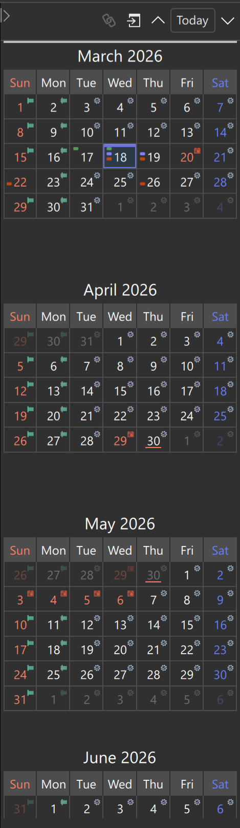
The Month View (Figure 5) displays the schedule in a month‑based layout.
By default, it is located on the right side of the Main View.
Like a standard calendar, it shows each month in a grid, from the first day to the last day.
The number of months displayed varies depending on the window size and the width of the view.
If you change the starting day of the week in the settings, the Month View will also update its weekly layout accordingly.
The selected date is highlighted with a border in .
Display Inside Each Date Cell
The contents shown inside each date cell vary depending on the assigned schedules.
… An All‑day Schedule is assigned
… One or more Timed Schedules are assigned
… One or more Triggers are assigned
If any of the above indicators are shown, the Date‑specific Schedule for that day will be executed.
… A Holiday Schedule will be executed
… The Default Schedule will be executed
… The corresponding Day‑of‑Week Schedule will be executed
… No schedule is assigned.
Content display depends on the Viewer settings.
Day‑of‑Week Icons
The icons representing Day‑of‑Week Schedules do not change even if you modify the starting day of the week.
In other words, the icon always represents the first day of the week.
Operations in the Month View
The Month View always operates on the topmost month displayed.
If you click a date in a month shown below, that date becomes selected and the corresponding month moves to the top.
To display months that are not currently visible, use the
and
buttons.
Each button scrolls the view by one month upward or downward.
Scrolling is also possible using the mouse wheel or a two‑finger swipe on a touchpad.
Pressing the Today button selects today’s date and scrolls the current month to the top.
Pressing the button scrolls the view so that the selected date and its month move to the top.
This is useful when you have scrolled away and lost sight of the selected date.
The button becomes available when the Main View is set to a schedule type other than Date.
Pressing this button switches the Main View back to the Date view.
When the Main View is in the Date view, the Month View enters Linked Mode, meaning it stays synchronized with the Main View.
In Linked Mode, the button appears as
and cannot be used.
The Month View supports copy and paste operations.
You can copy the schedules assigned to a selected date and paste them onto another date.
To select multiple dates, hold the Ctrl key (Windows) or the ⌘ key (macOS) while clicking.
Use the View menu or the context menu to perform actions on the selected dates.